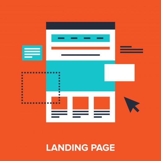
What Makes a Perfect Landing Page?

A first-class landing page is one of the foundations of successful digital marketing. For those of you who don’t know what a landing page is, it’s the page your website visitors arrive on after clicking a link, such as a Google text ad or a link in an email.
Marketers with limited experience often direct all of their traffic to their homepage, but this can be a bit of a slip-up. Opting for more specific landing pages can help improve the user’s experience by ensuring it is more suitable for their needs.
Even if you have an impressive offer and fully optimised PPC ads, your conversion rate is bound to suffer if you have poor landing pages. So, if you’re asking “what makes a great landing page?” read on for our thoughts and advice.
Effective Planning
Consider Your Goals
Where marketing is concerned, it’s always important to define your goals whilst planning your campaigns. If you know what it is that you hope to achieve, then it will be easier to produce the work. When working on a landing page, for instance, you need to consider what you’d like your page visitors to do once they arrive, whether that be buying something, filling out a form or signing up for a newsletter. Without clear-cut goals, you won’t be able to track your progress.
Know Your Audience
It’s important to understand your audience so that you can tailor your landing page appropriately. In other words, knowing your audience will allow you to write content in a suitable tone of voice, as well as help you to meet their needs. What’s more, you should think about how the visitor has found you; different content might be better suited to those who have landed on the page via Twitter versus those who have come from Google.
Carry Out Competitor Analysis
As well as your audience, it’s also worth checking out the competition. Find out what works well for them, or perhaps what doesn’t work at all. This will help you understand what you need to avoid and what you could potentially take inspiration from.
Quality Content
Keep it Short and Sweet
Landing pages should always provide all of the necessary information, but without overwhelming the visitors. Too much text will increase your bounce rate because it will drive visitors away. Keep it short and sweet, with the essentials only!
Great Headlines
Headlines on landing pages should always grab the visitor’s attention by reiterating your offer. You can then use subheadings and body text to elaborate. Make sure you offer is truly worthwhile; otherwise all your efforts will be a waste of time.
Flawless Design
Clear Call-to-Actions
Your landing page visitors should know exactly what to do next by means of big, bold call-to-actions. These could be anything from “Get Started” to “Submit” or “Download”. More often than not, marketers place their call-to-actions in the headline text so that it can’t be missed. It’s best to experiment and see what works best, in terms of both placement of your CTA and the wording used.
Beautiful Images
Great, relevant images and graphics tend to make a web page more visually pleasing and improve the overall user experience. Visual cues such as arrows are also a great idea, because they point your visitor in the direction of a conversion.


